Modica SaaS
Design-made market differentiation
In a market teeming with over 100 direct competitors, the challenge at Modica was to create a standout experience. It wasn't a walk in the park, but we've never been ones to shy away from a good challenge. A daunting task, but not impossible.
The Approach: Strategic Innovation
The strategy wasn't about reinventing the wheel. Instead, it leveraged insights into the experience of a five-billion-user market. This provided validation for following some well-trodden paths while still introducing innovative solutions to tackle both current and future issues.
Headless Design System
At the heart of the experience strategy is a design system crafted around five core principles:
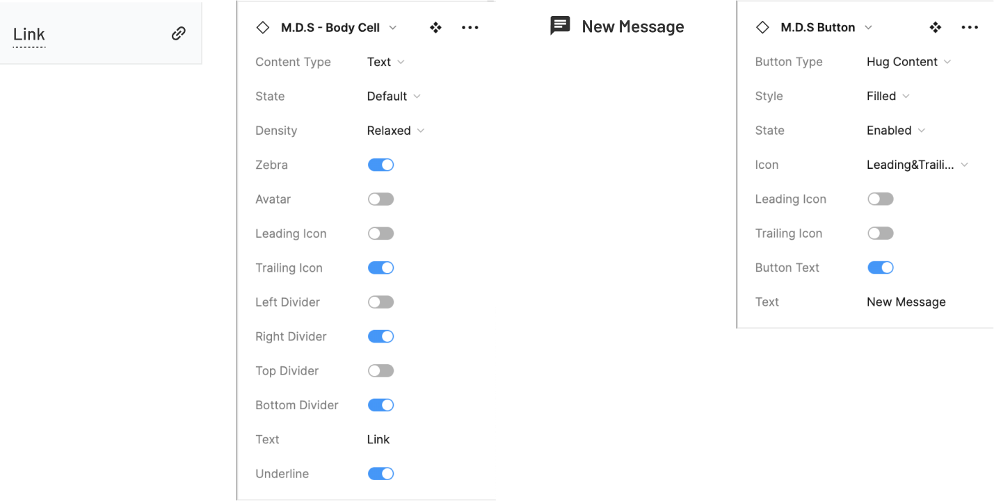
- Modularity: Our components ensure consistency and adaptability by accommodating diverse content types and interactions. They maintain design coherence through unified styles and accessibility features, ensuring a seamless user experience.
- Fully responsive: Eliminates the need for a separate app, saving significantly on initial overhead while providing a complete experience across devices.
- White label-ready: A flexible multi-brand design system, captures visual tone of voice accurately, all backed by a Figma-linked JSON file for seamless maintenance and brand additions.
- Progressive disclosure: Incorporates enterprise-level complexity without compromising usability. This approach slashed the learning curve by over 95%, (when compared with the current experience) and will lead to fewer support tickets and freeing up our Service Delivery teams to focus on enhancing customer experience.
- Accessibility-focused: Ensured that the design system adhered to WCAG guidelines, making the platform usable for people with diverse abilities. This not only expanded our potential user base but also demonstrated our commitment to inclusive design.
The Guiding Mantra: As Good As, Or Better Than "X"
This motto (where X equals any competitor) aims to foster an environment where improvements were welcomed from all directions. But it came with some ground rules:
- New solutions need to address novel problems the current setup can't handle.
- Reusability across multiple pages to maintain a low learning curve.
- All improvements must incorporate foundational properties such as colour, typography and spacing tokens.
- Responsiveness is a must.
- Accessibility must be considered in every new feature or improvement.
Areas of Significant Improvement
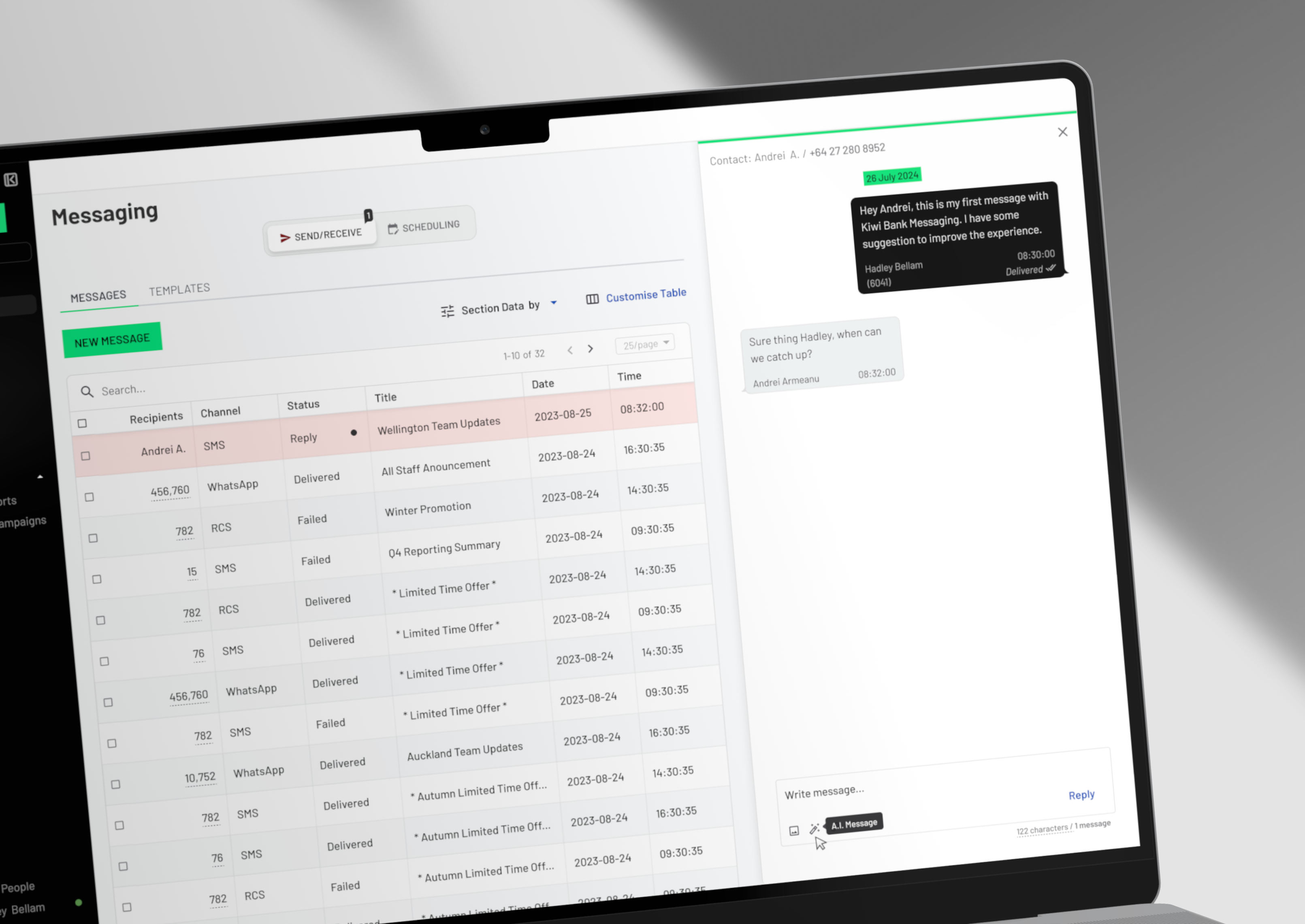
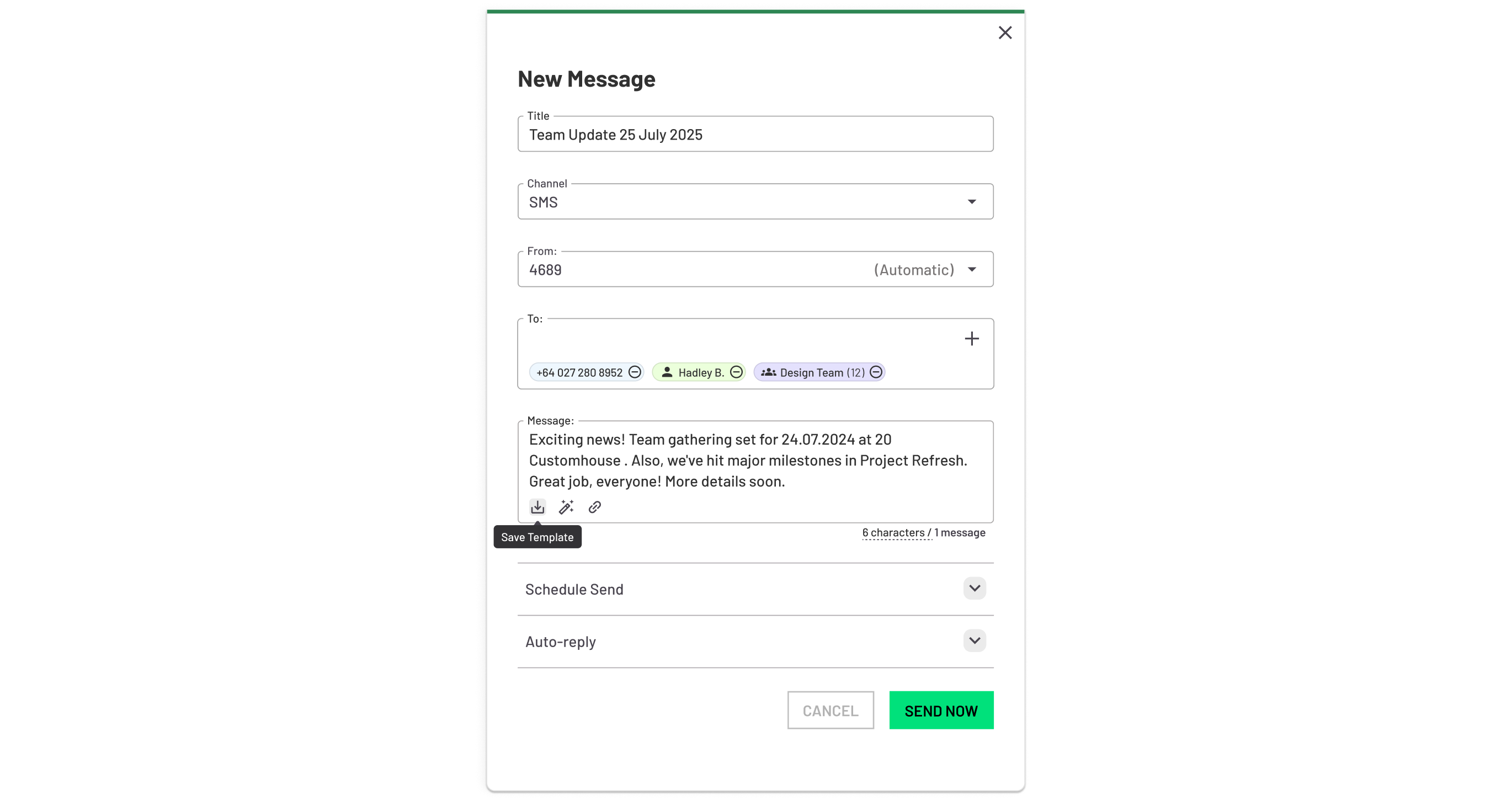
- Data tables that set new standards: One of the most flexible data table systems in the industry. It allows for deep data dives and advanced workflow customisation, all while being fully responsive and accessible.
- Side menu reimagined: Transformed from a simple link repository into a bespoke work area, with careful attention to keyboard navigation and screen reader compatibility.
- The not-so-secret sauce = progressive disclosure: Different channel experiences woven together in a way that significantly boosted the adoption rate of complex features, with accessibility baked in from the start.


